Garvis Pro by James Todd Design

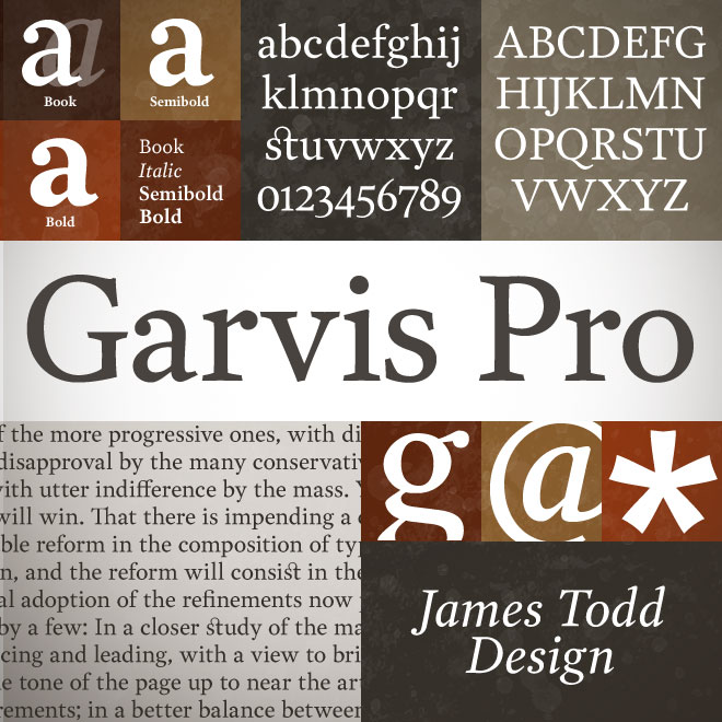
James Todd comes out swinging with his inaugural family Garvis Pro. It is a beautiful text face that works equally well at larger display sizes and has an incredible character set supporting a multitude of languages.
| Garvis Pro | 4 Fonts | $33 Single | $129 Family | Preview Online |
Julieta Pro by Latinotype

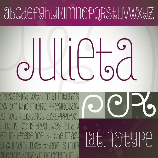
Latinotype’s Julieta is a romantic swashy monolinear gem. It screams to be set large and with the character palette open, so you can pick and choose from the 810 glyphs to build beautiful titles and settings.
| Julieta Pro | 5 Fonts | $59 Single | $207 Family | Preview Online |
Sorren by Latinotype

Sorren is a timeless condensed grotesque that allows you to set large bold headlines with finesse. Four weights add to its versatility.
| Sorren | 4 Fonts | $64 Single | $168 Family | Preview Online |
Akzentica 4F by 4th February

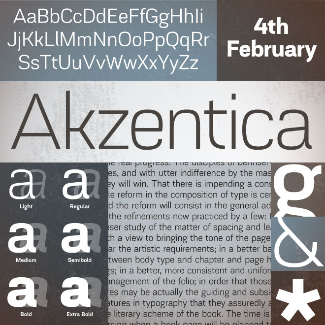
4th Februrary’s latest is a full-featured take on the technical sans. Clean and crisp with a range of weights makes this a versatile family. Settings in both small and large sizes work remarkably well.
| Akzentica 4F | 12 Fonts | $32 Pair | $178.80 Family | Preview Online |
|
New Foundry: James Todd
|
New Foundry: Niramekko
|
Most Creative: Yellow Design
|
Fontspring Blog
Apparently, Being a large corporation doesn’t make you any more organized than the rest of us. A prominent foundry recently filed suit against NBC Universal for $3.5 million for violating their license agreement. Does font licensing need to be so complicated? Fontspring has always set out to be as transparent and user friendly as we possibly can. While it doesn't take the responsibility off of you to read EULAs, we have taken great lengths to simplify the process. Read our comments in our blog post.
|
Pablo |
Anamorphic Typography |
Where Do I Begin? |
|
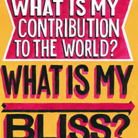
Pablo developed a series of lettering illustrations based on signage from the Mission District in San Francisco. Read a great post on imprint showcasing his work or find out more about Pablo on his website. |
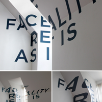
Thomas Quinn created this typographic installation above his parents' garage. As you move about the room, the type changes shape. Stand in the correct spot and it all comes together... |
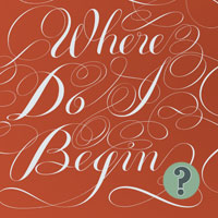
James Todd is curating a collection of quotes from designers, artists, musicians, and other generally creative people about how to begin a project. Learn from experts on getting started. |
I feel like this is the first time I've received this newsletter, but it's fantastic! Thank You!
Patrick Harrington - Mildly Geeky
I know how great your webfonts are, and I have been recommending that every web designer I know buy them. There are so many who make their own with undesirable results.
John Merrifield - Stiff Upper Glyph
I am newly registered and I would like to sincerely compliment you on your website. It is clean, attractive, and easy to read... Just like a good font.
Michael Brown
Thank you for your excellent service, we'll have no hesitation in using you again and recommending you to anyone who asks.
Tim Smith - Creative Infusion



 We're happy to welcome James Todd to Fontspring. His first font family is a warm, humanistic serif text face
  Ryan Martinson came out of nowhere with his ecclectic collection of dirty display fonts to capture the attention of quite a few designers. His fonts are detailed, carefully crafted and could definitely find a home in your toolbox.

