The rounded-corner web now has some fonts to match. This month’s new releases are smooth as butter and just as delicious...
Museo Sans Rounded by Exljbris
Jos Buivenga extends his popular Museo Sans with a beautiful, six-weight extension called Museo Sans Rounded. When you need a lighter feel to your work, try this family.
| Museo Sans Rounded | Six Fonts | $24.50 single | $119 family | Preview Online |
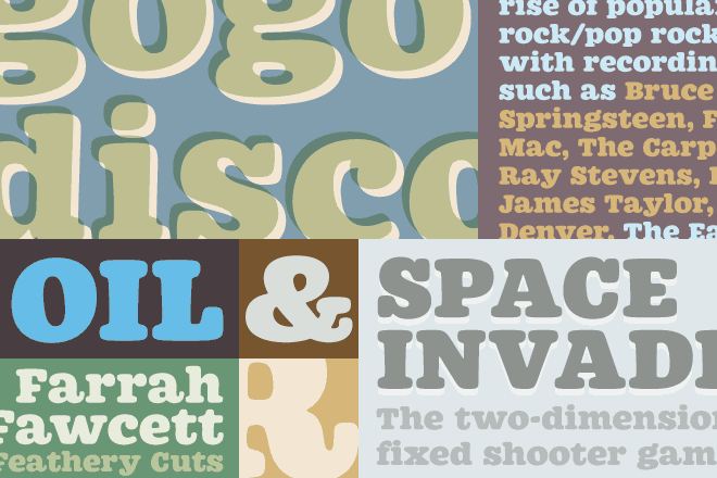
Westin Black by Miller Type Foundry
Richard Miller’s Westin Black is a fun display face taking cues from the groovy Cooper Black. Westin Black has a smooth, modern feel and works great at headline sizes.
| Westin Black | One Font | $24.70 | Preview Online |
Proxima Nova Soft by Mark Simonson
Mark continues to build on his venerable Proxima Nova family with the addition of four new rounded fonts. A great addition to a must-have family.
| Proxima Nova Soft | Four Fonts | $38 single | $96 family | Preview Online |
Gesta Condensed by RType
Rui Abreu follows up his popular Gesta family with a coordinating condensed. Gesta Condensed contains eight fonts: light, regular, medium and bold with matching italics.
| Gesta Condensed | Eight Fonts | $34 single | $237 family | Preview Online |
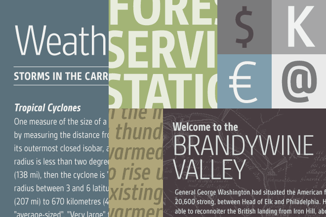
Supria Sans by HVD Fonts
Hannes von Döhren’s contribution to the grotesque sans genre is a functional, beautiful family called Supria Sans and Supria Sans Condensed. The family has enough weights and styles to be useful for many projects. Interestingly, each font has both a matching oblique and italic, further extending the usefulness of the face.
| Supria Sans | 36 Fonts | $65 single | $649 family | Preview Online |
|
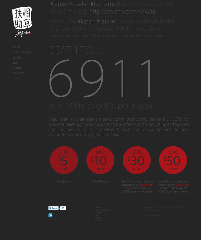
The incredibly talented type designer Neil Summerour launched the Sogo Japan site shortly after the earthquake disaster. The website helps people (and designers in particular) direct their donations to Japanese organizations that can deliver the most effective help. Donors who contribute $30 or more are rewarded with a custom version of his fantastic Angel Script font. Sogo Japan was designed top to bottom with his own Akagi font family, a workhorse humanist sans with 10 weights and matching italics. |
|
Have you designed a website with Fontspring webfonts? Drop us a note. We'd like to feature your work in a future issue of FONTFACE.
|
The Secret Life of Punctuation |
Chuck Norris & Typography |
Miscellaneous Webfont Bits |
|
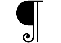
The blog of Keith Houston, Shady Characters, aims to chronicle the origins of unusual punctuation marks. He’s currently in a two-part series on the lowly pilcrow. |
We couldn’t resist including this classic Typophile thread that showcases Chuck's roundhouse kick to all things typographic. Our favorites: “Chuck Norris calls Frutiger ‘Freedom Font’ because its name sounds French.” and “Chuck Norris biography is an entire book made of orphans and widows.” |
Opera 11.10 now supports WOFF format. The webfont-focused Ampersand conference is coming this June. Paul Irish reports that Firefox 4 will no longer suffer from the Flash of Unstyled Text (FOUT). |


