Ahimsa
Satori | November 19, 2019
A TOP-TIER TYPEFACE OF 2019
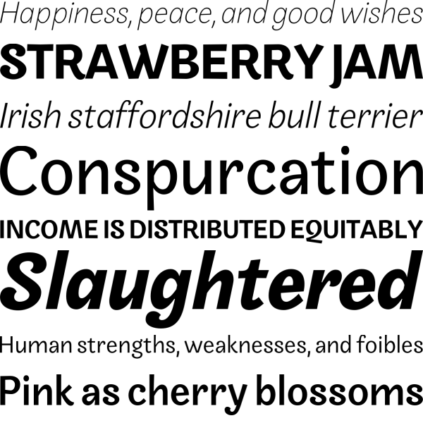
Ahimsa’s dynamic contrast feels rhythmic and fun to read in all 12 of its variations.
As 2020 hits us over the head with bad news, perhaps now is an ideal time to take a step back, and focus on the good. We’ve sorted through the 1,057 new font families that Fontspring released in 2019 and hand-picked our favorites. Five of these were clear standouts and have been noted as “Top-Tier Typefaces.” Here is our list.
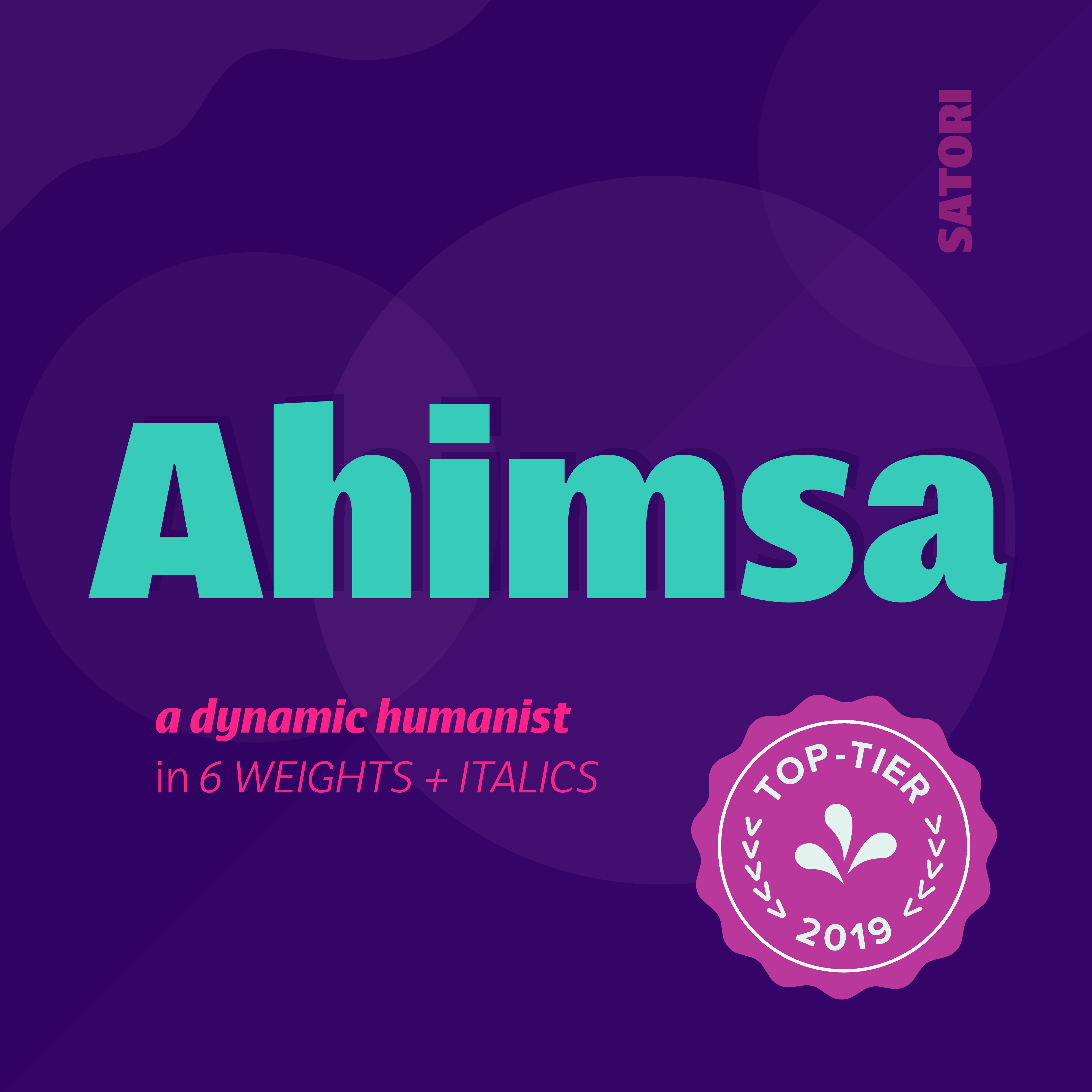
A TOP-TIER TYPEFACE OF 2019
Ahimsa’s dynamic contrast feels rhythmic and fun to read in all 12 of its variations.
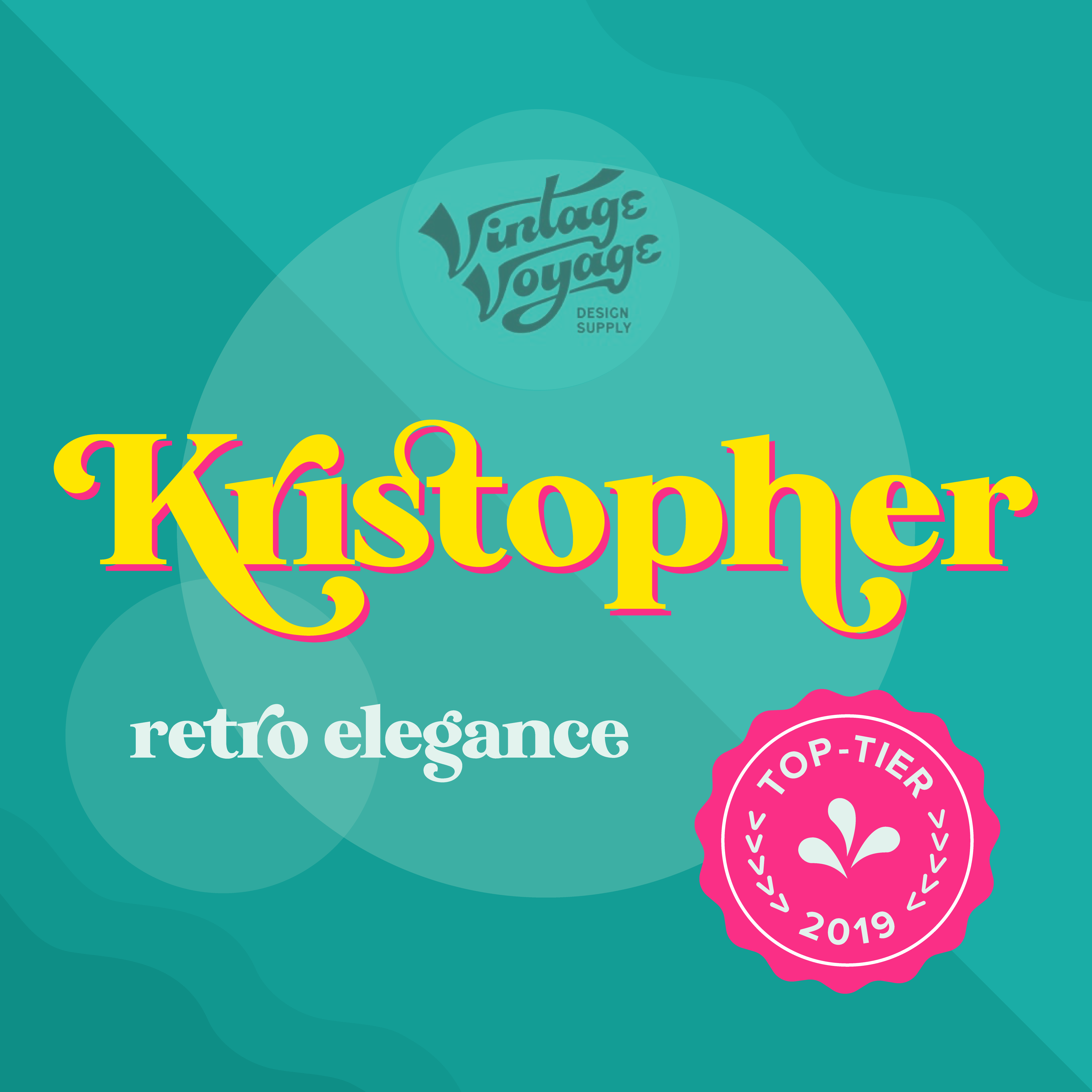
A TOP-TIER TYPEFACE OF 2019
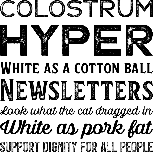
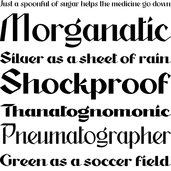
Kristopher’s grandiose swashes come with a plethora of alternates for a customized look with retro roots.
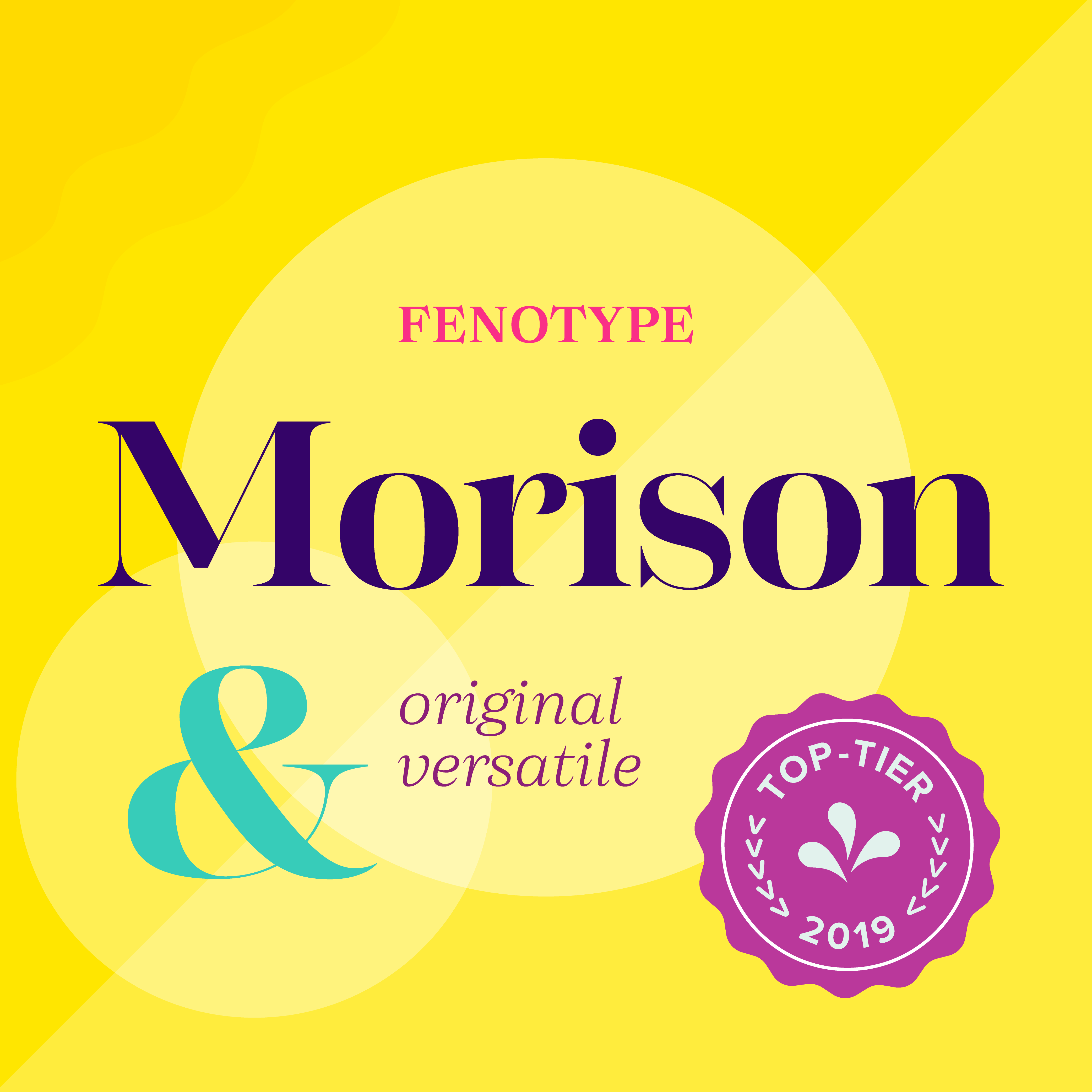
A TOP-TIER TYPEFACE OF 2019
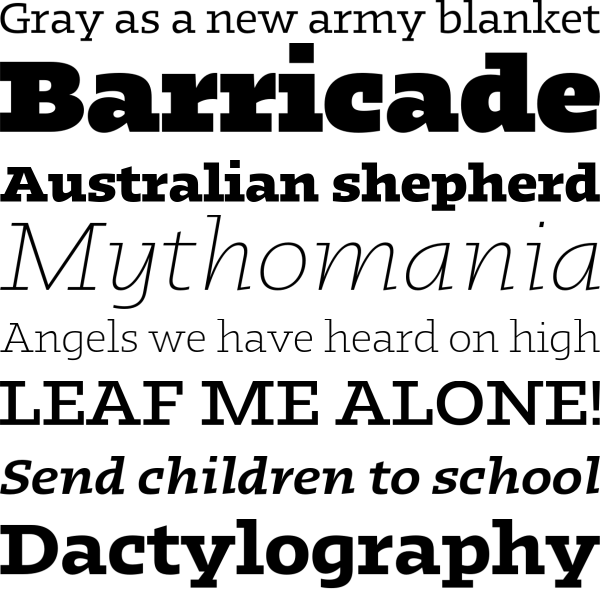
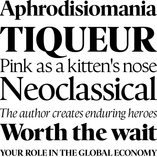
This stunning array of 32 fonts is classy, legible, and is a welcome addition to the recent rise of modern serifs.
A TOP-TIER TYPEFACE OF 2019
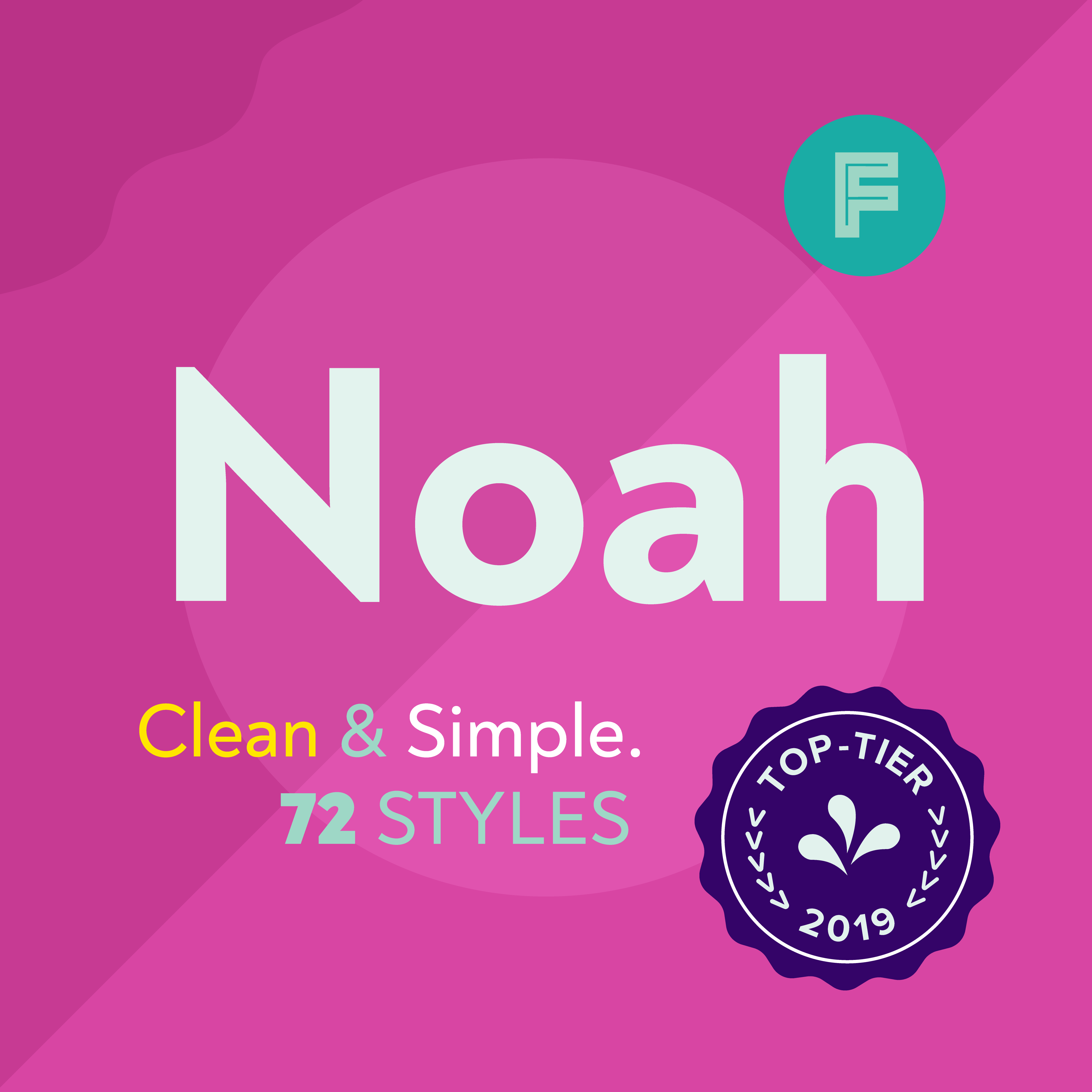
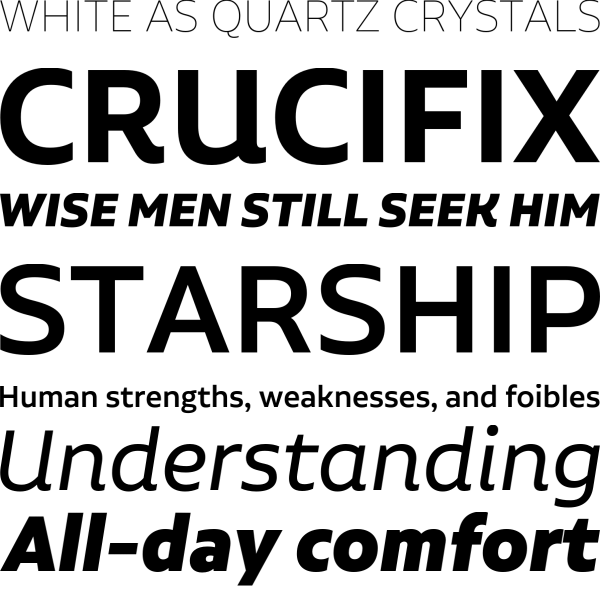
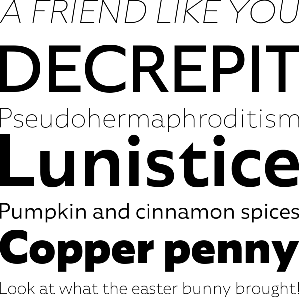
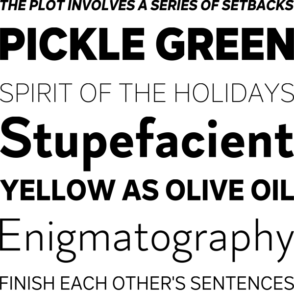
This extensive 72-font family blends the best aspects of humanist and geometric styles into one impressive collection.
A TOP-TIER TYPEFACE OF 2019
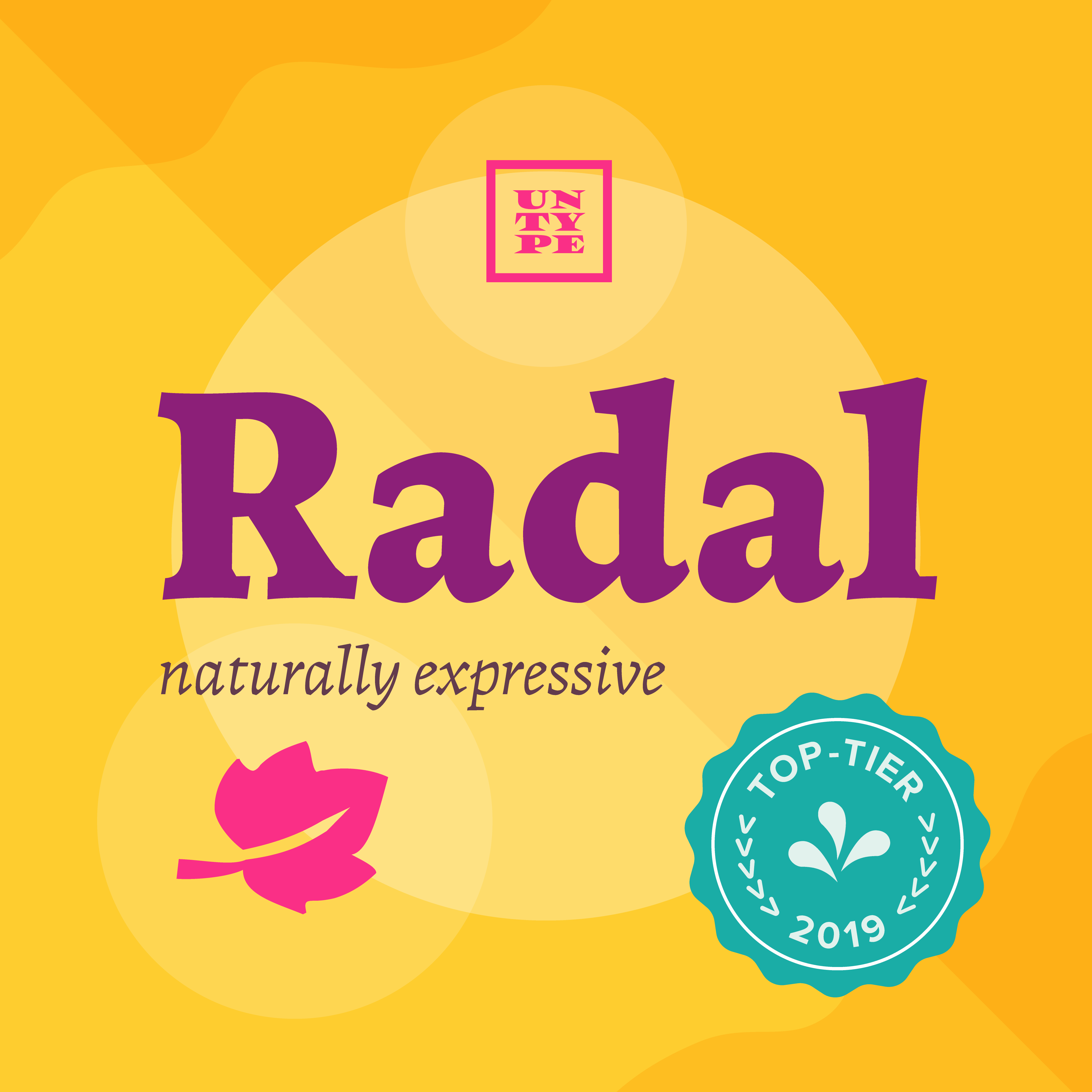
Thickened ascenders give this crunchy serif an organic look while maintaining a natural sense of balance.
Los Andes Type | January 2019
Fenotype | March 2019
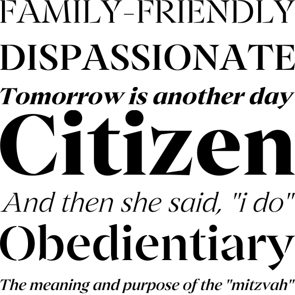
Mostardesign | November 2019
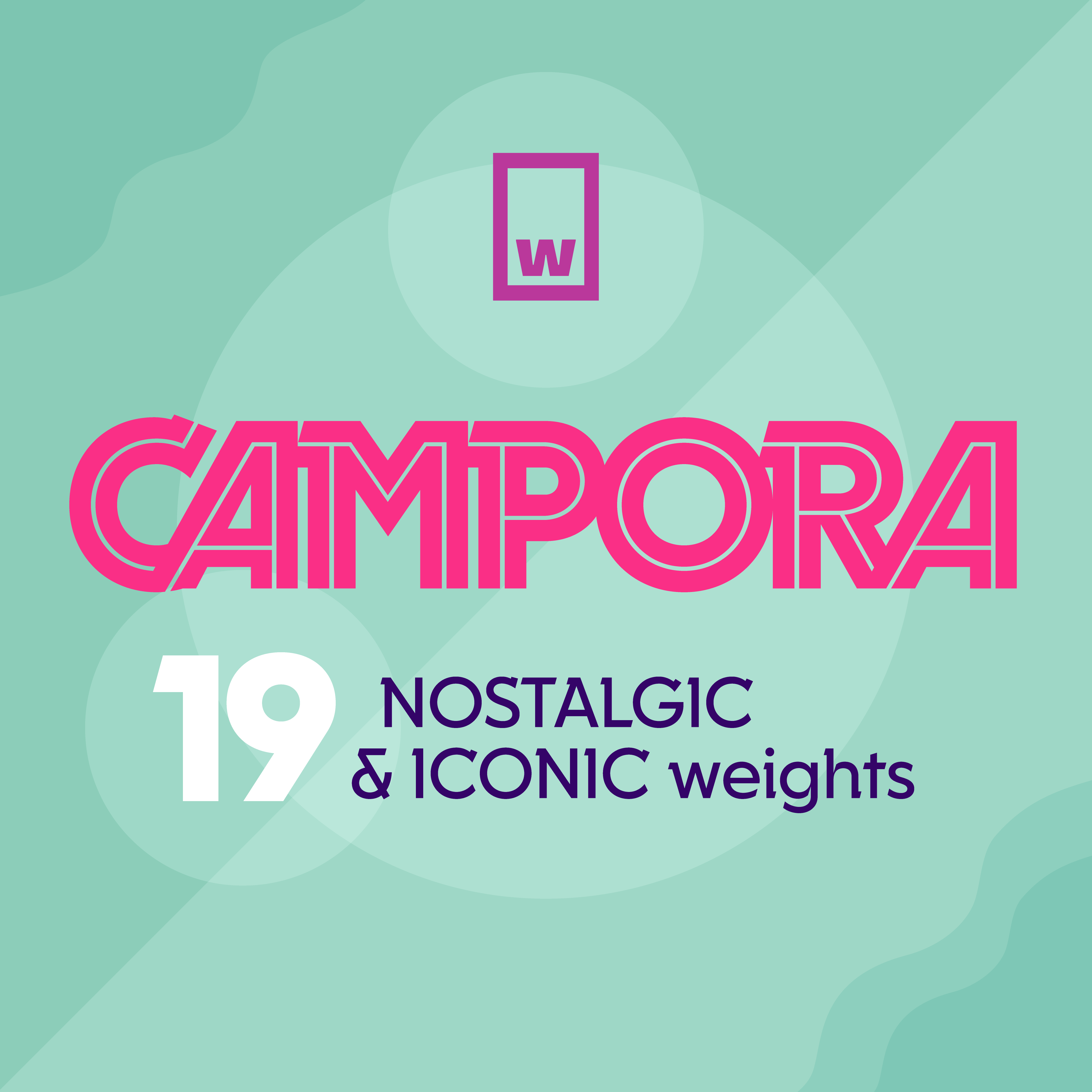
Campora has a powered-up 80s arcade aesthetic, with a wide range of chunky, inline, and thin weights.
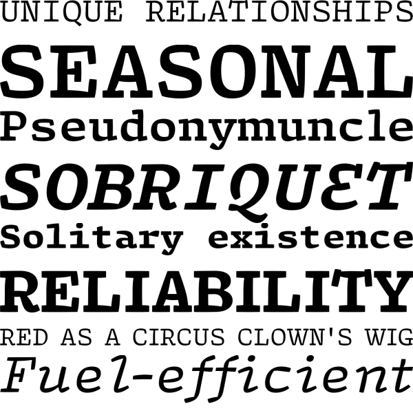
JTD | March 2019
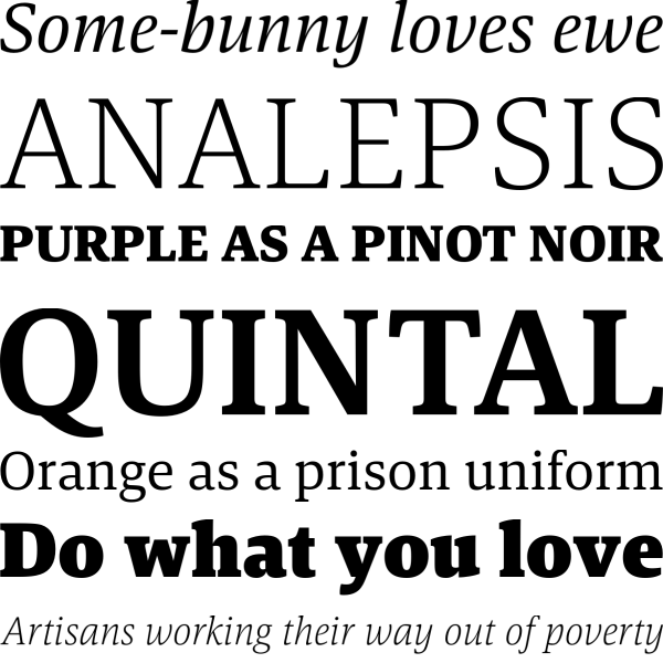
Hoftype | October 2019
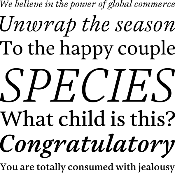
Corradine Fonts | August 2019
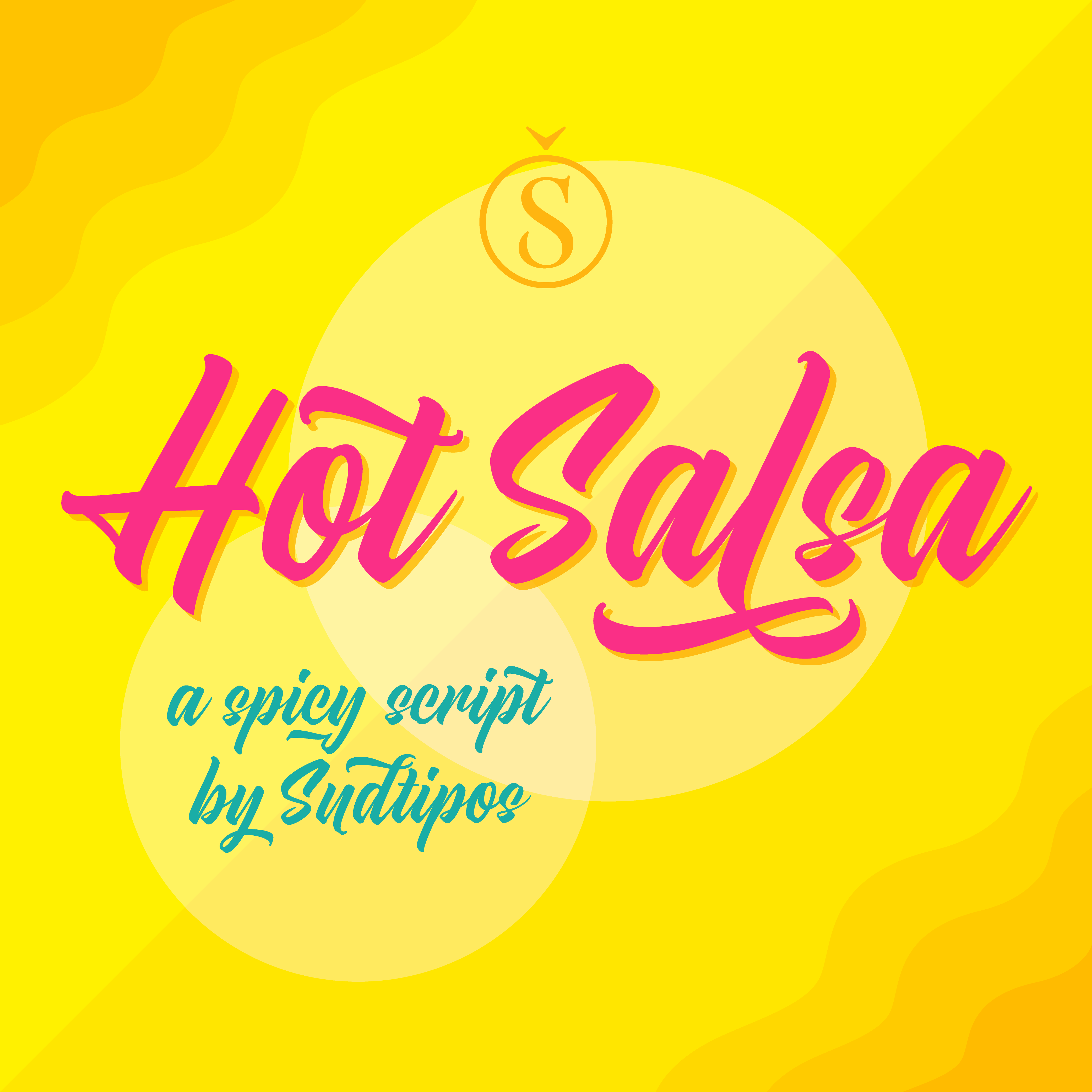
This spicy script brings a fresh new flavor to the table. Its lively swashes and alternates are effortlessly enticing.
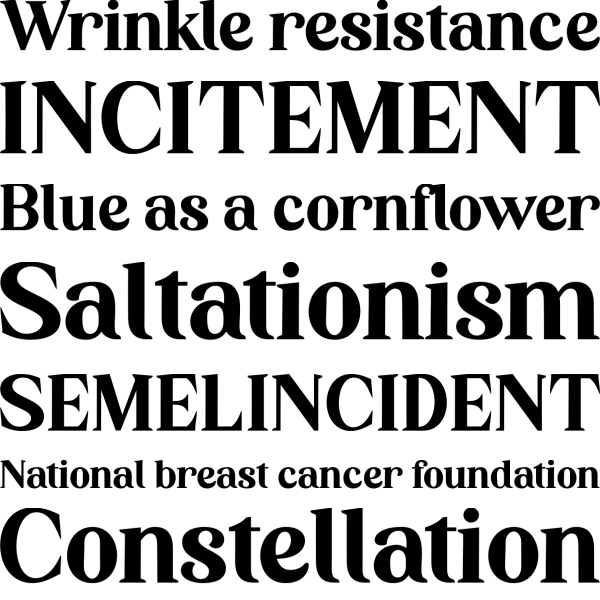
Picatype Studio | December 2019
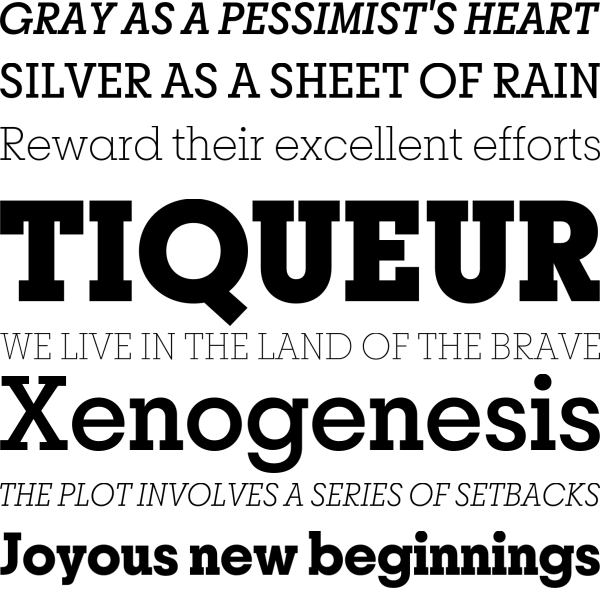
Latinotype | March 2019
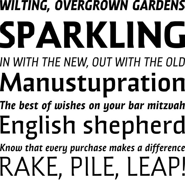
Sardiez | August 2019
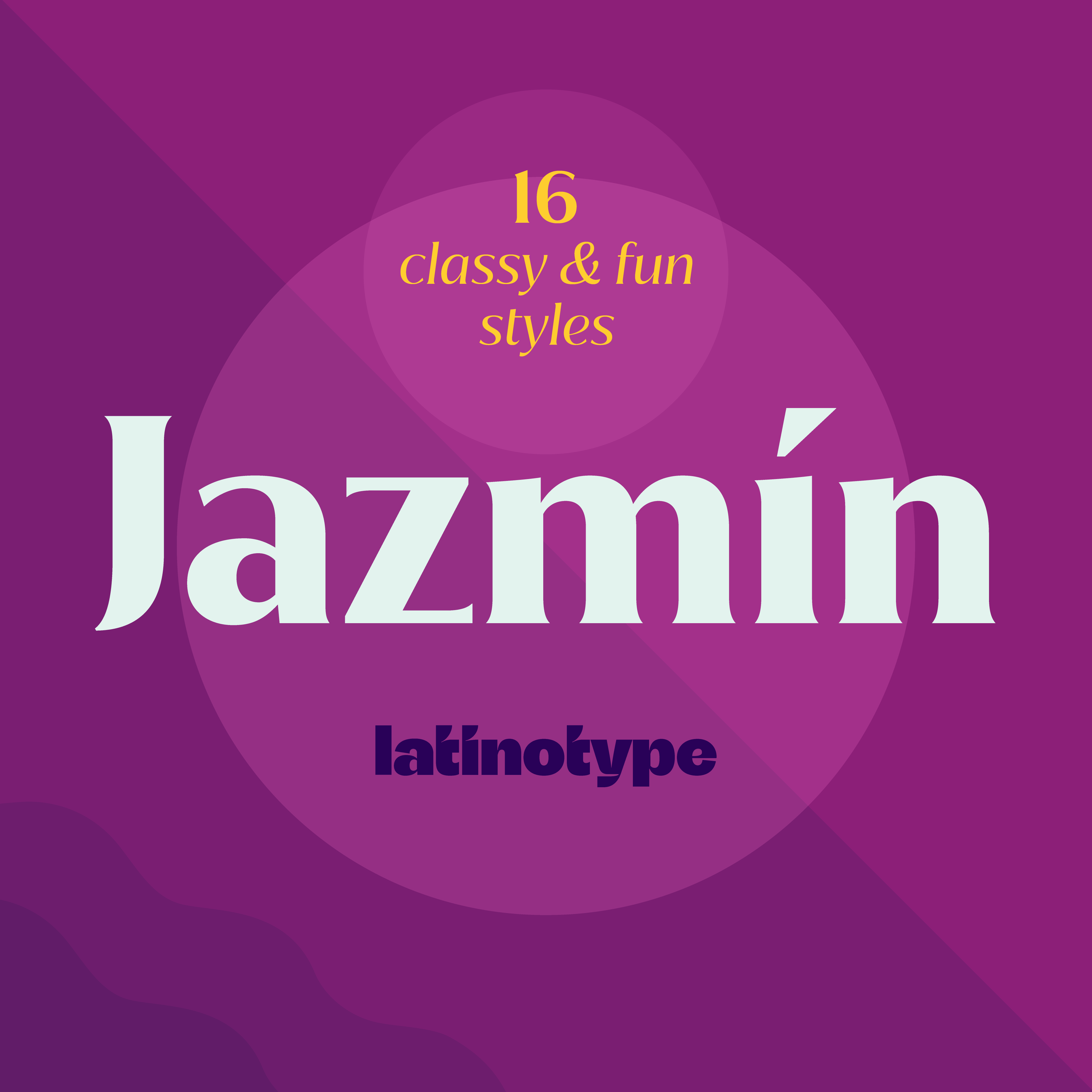
Equal parts elegance and pizazz, Jazmín is pure eye candy, from the pointed teardrop terminals to the alternate descender of the lowercase g.
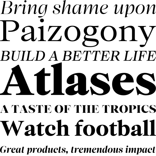
Branding With Type | June 2019
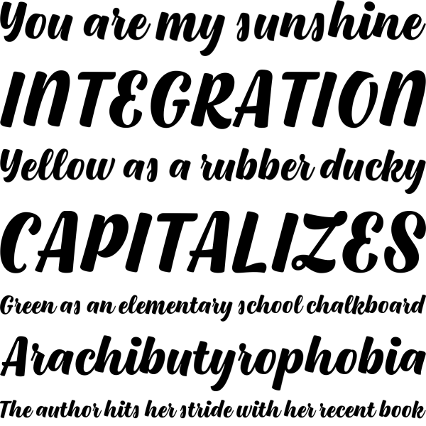
Los Andes Type | October 2019
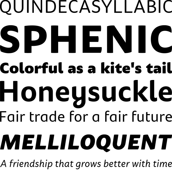
Harbor Type | August 2019
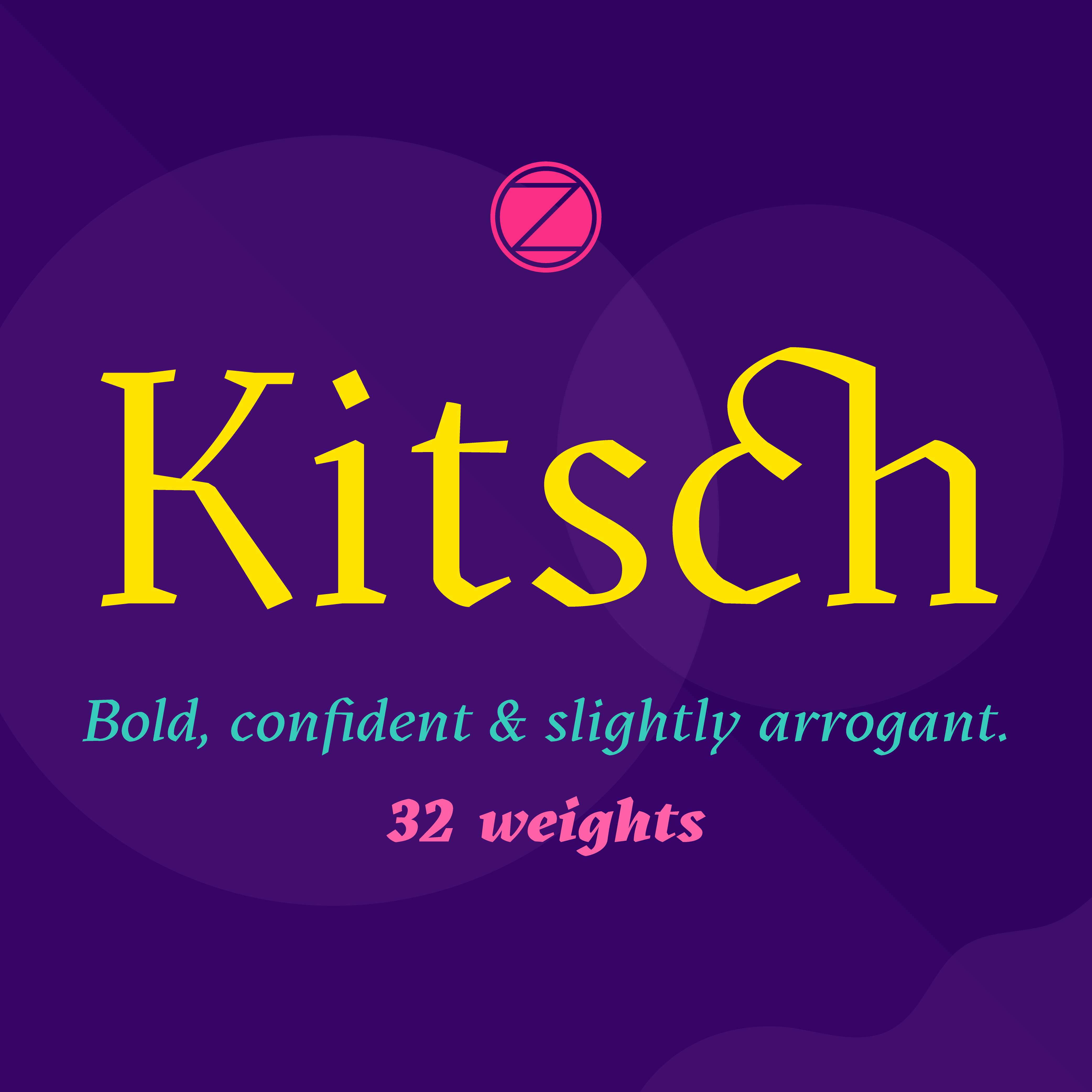
Kitsch’s streamlined curves contrast nicely with angular edges for a sturdy yet fashionable feel.
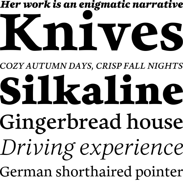
Paulo Goode | March 2019
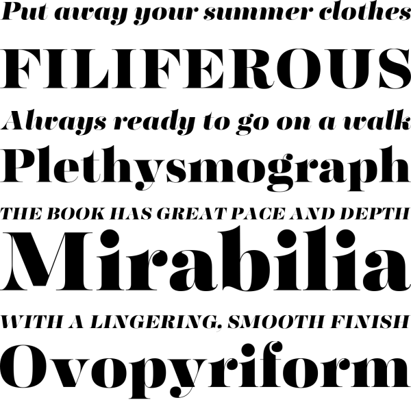
Fenotype | August 2019
Sudtipos | October 2019

With any combination of Lunair’s stackable layers, it feels fresh, clean, and polished.
Fenotype | January 2019
Maciej Włoczewski | May 2019
Adam Ladd | August 2019
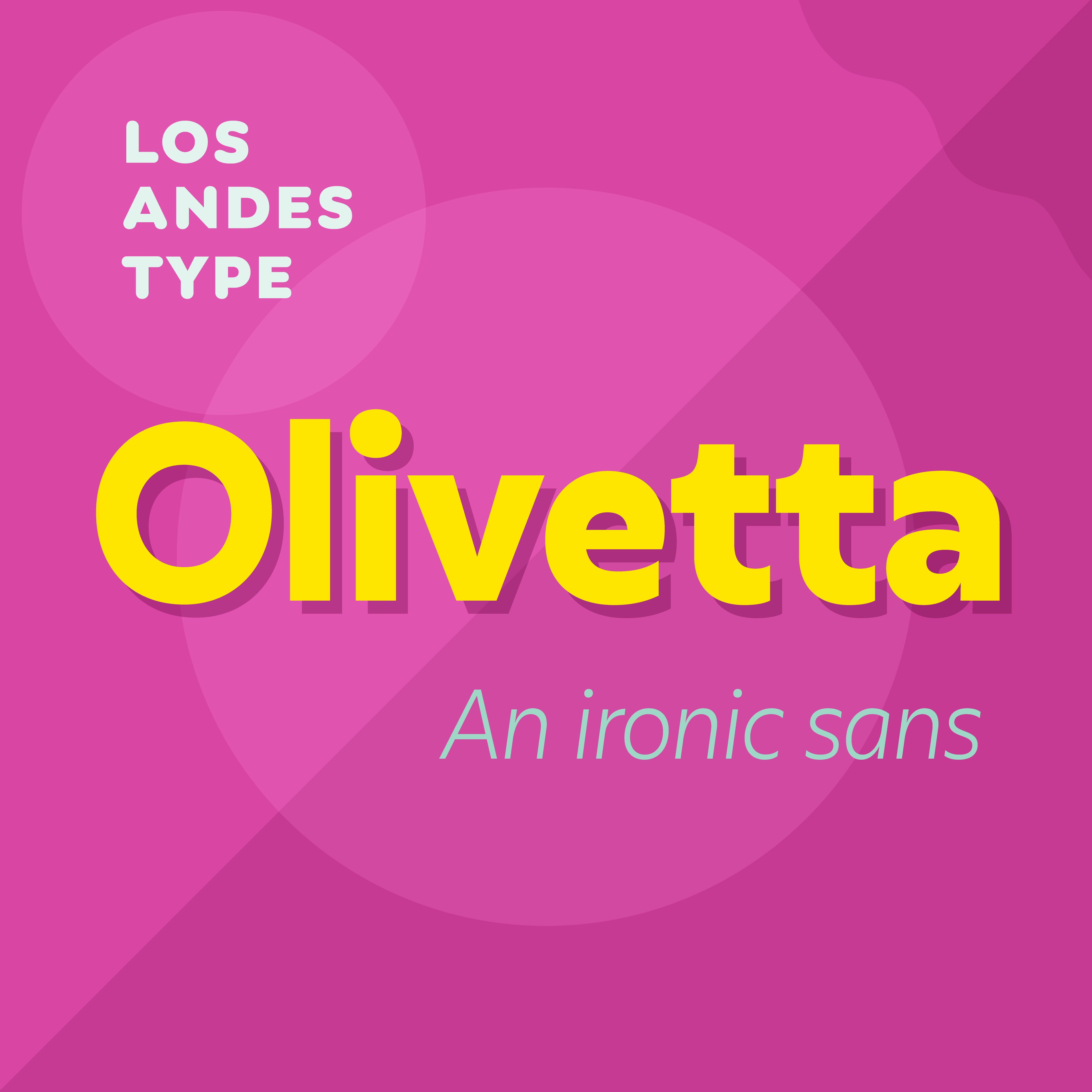
Olivetta looks top-heavy but feels balanced nonetheless. It’s the perfect mix of spontaneity and stability.
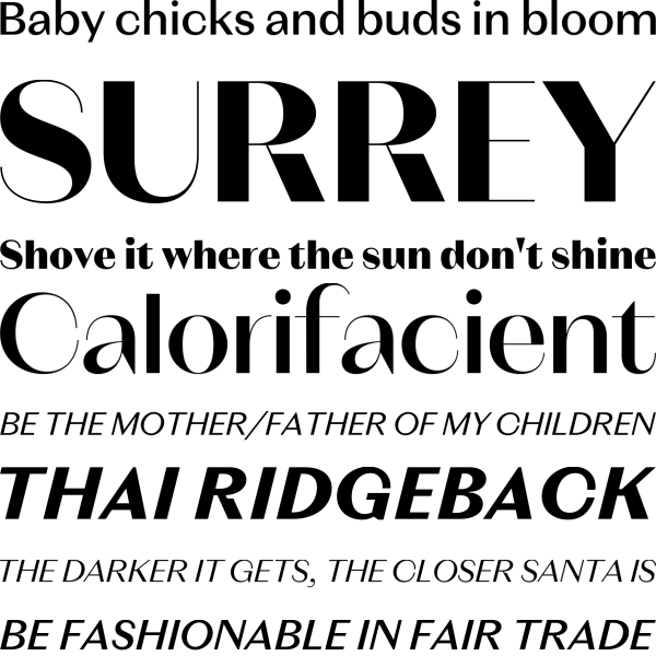
Studio René Bieder | April 2019
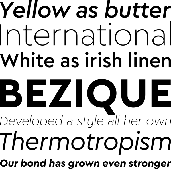
Type Atelier | June 2019
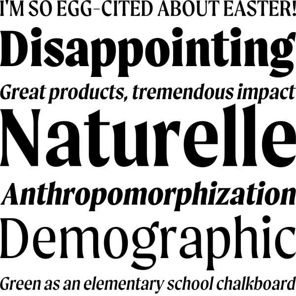
The Northern Block | February 2019
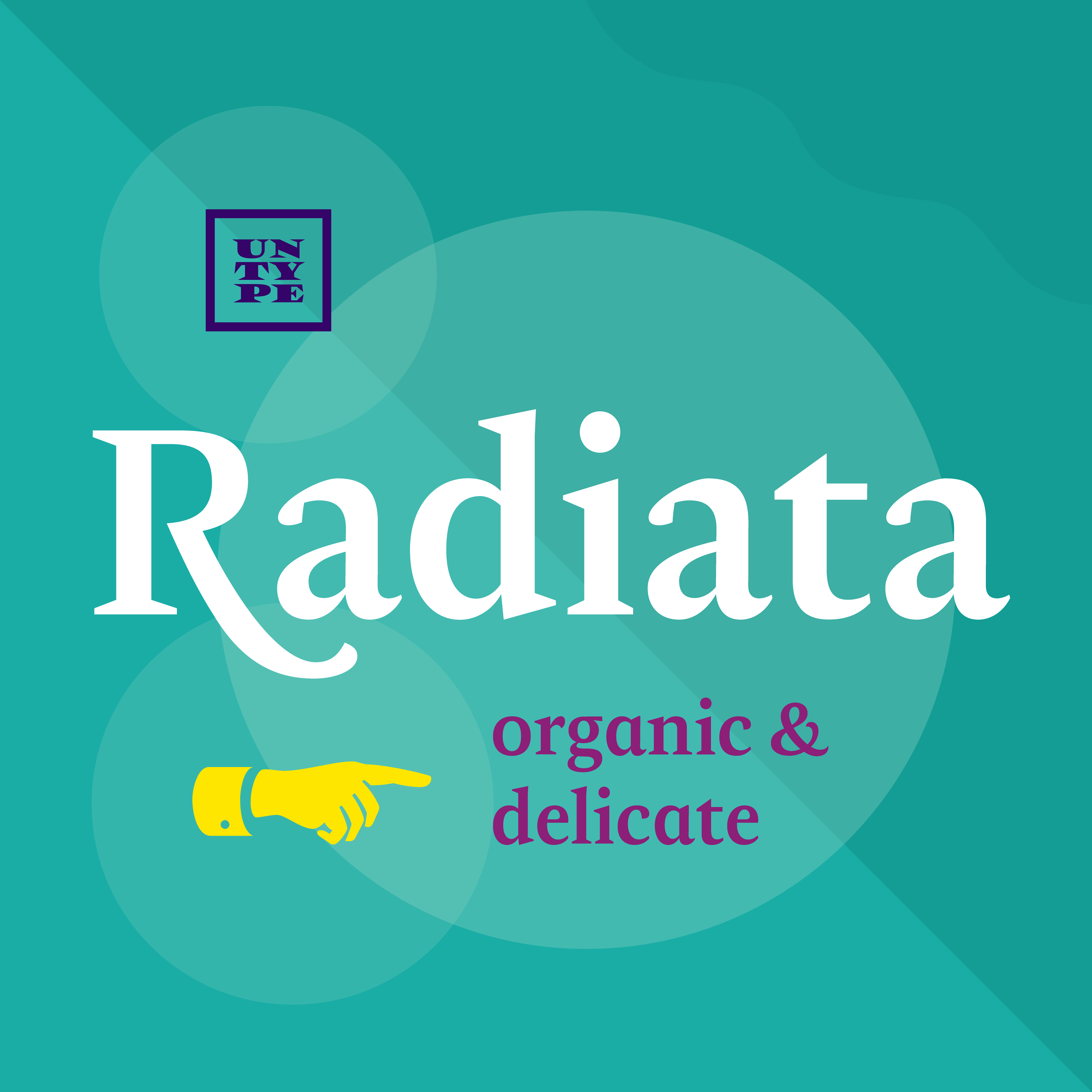
Elegant, delicate, and understated; this beautiful best-selling font of 2019 has earned itself a place on our list.
Shinntype | May 2019
Vintage Voyage Design | May 2019
Fontfabric | August 2019
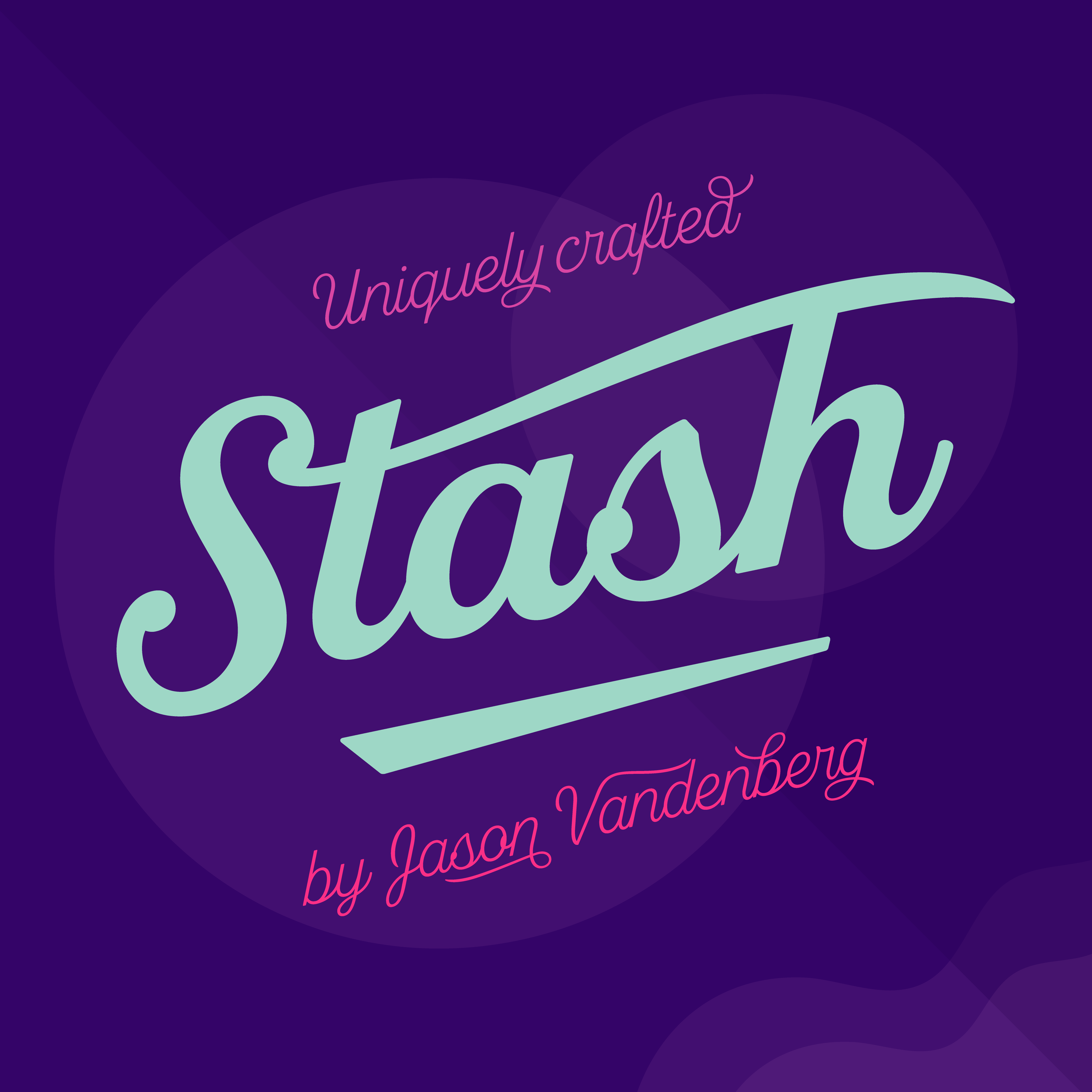
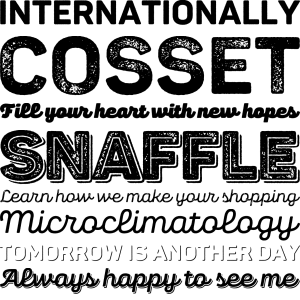
Jason Vandenberg’s family of ten script fonts is timelessly stylish in either a clean modern look or worn textured finish.
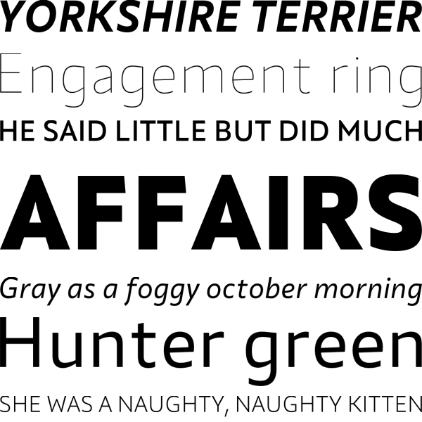
Ani Dimitrova | November 2019
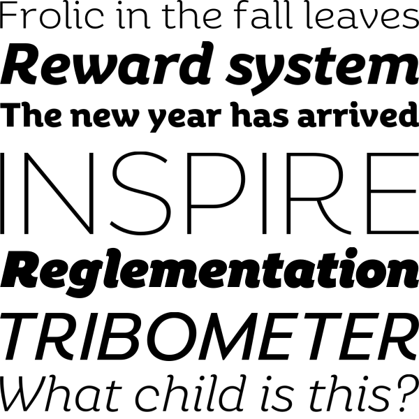
Paulo Goode | September 2019
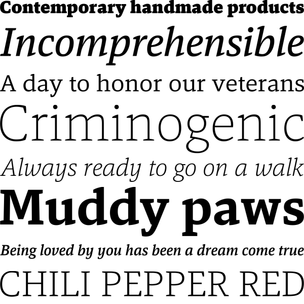
Hoftype | March 2019
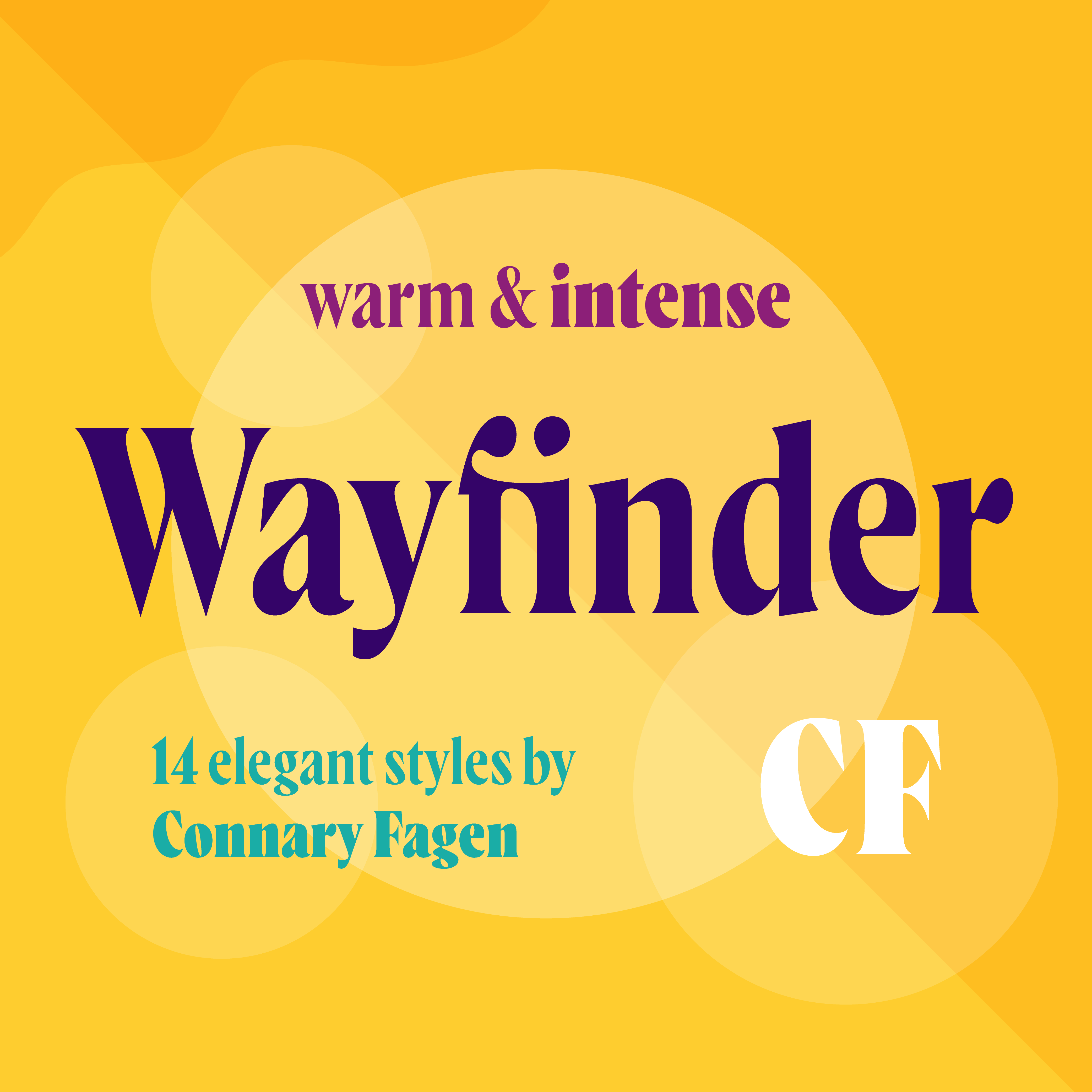
This slim, flared 14-font family looks dapper and tastefully refined.
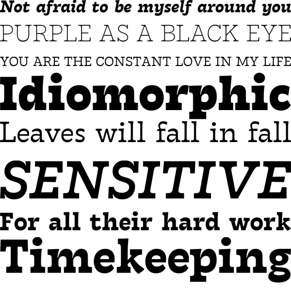
Zetafonts | August 2019

Typetype | May 2019
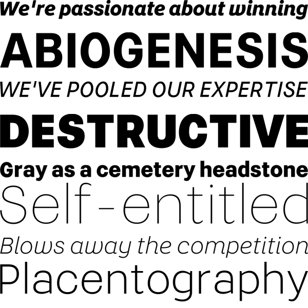
Paulo Goode | July 2019
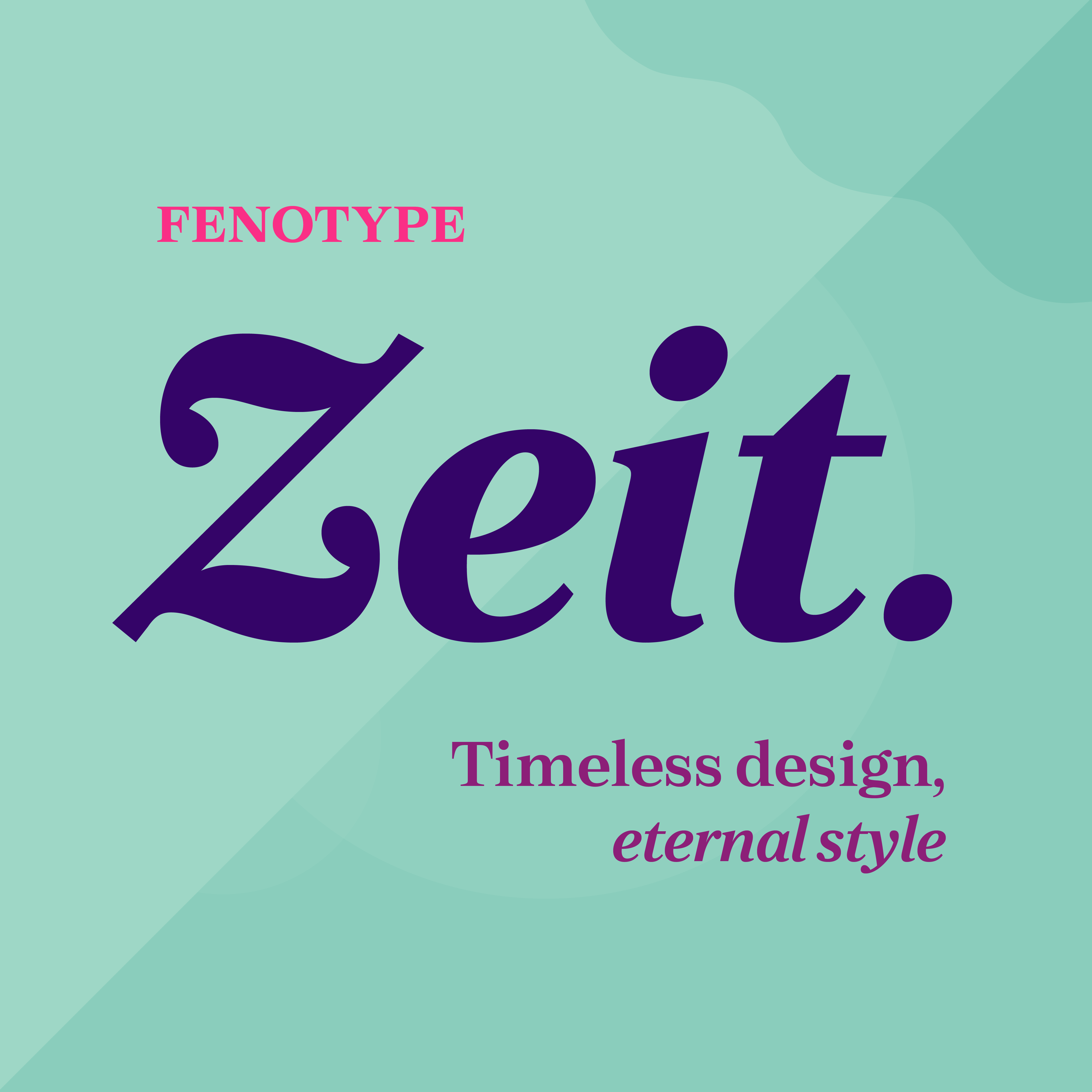
Fenotype’s elegant serif family is fashionable yet familiar, trendy yet trustworthy, and built to withstand the test of time.
Choosing our top typefaces of the year is never an easy task. It often feels like we’re comparing apples to oranges; some are large families while other typefaces we’ve picked may only consist of one font. It’s a good reminder that we value quality over quantity. For our third annual “Best of Fontspring” list, we’ve chosen 45 typefaces that were released in 2019 that are excellent examples of the diverse and beautiful array of fonts available through our site.
Once again, five of these typefaces seemed to turn our heads more than the rest, and deserved to be called “Top-Tier:” Ahimsa (Satori), Kristopher (Vintage Voyage), Morison (Fenotype), Noah (Fontfabric), and Radal (Untype). Some were bestsellers and others flew under the radar, but all of these font families were fresh, beautiful, and unique enough to catch our attention.