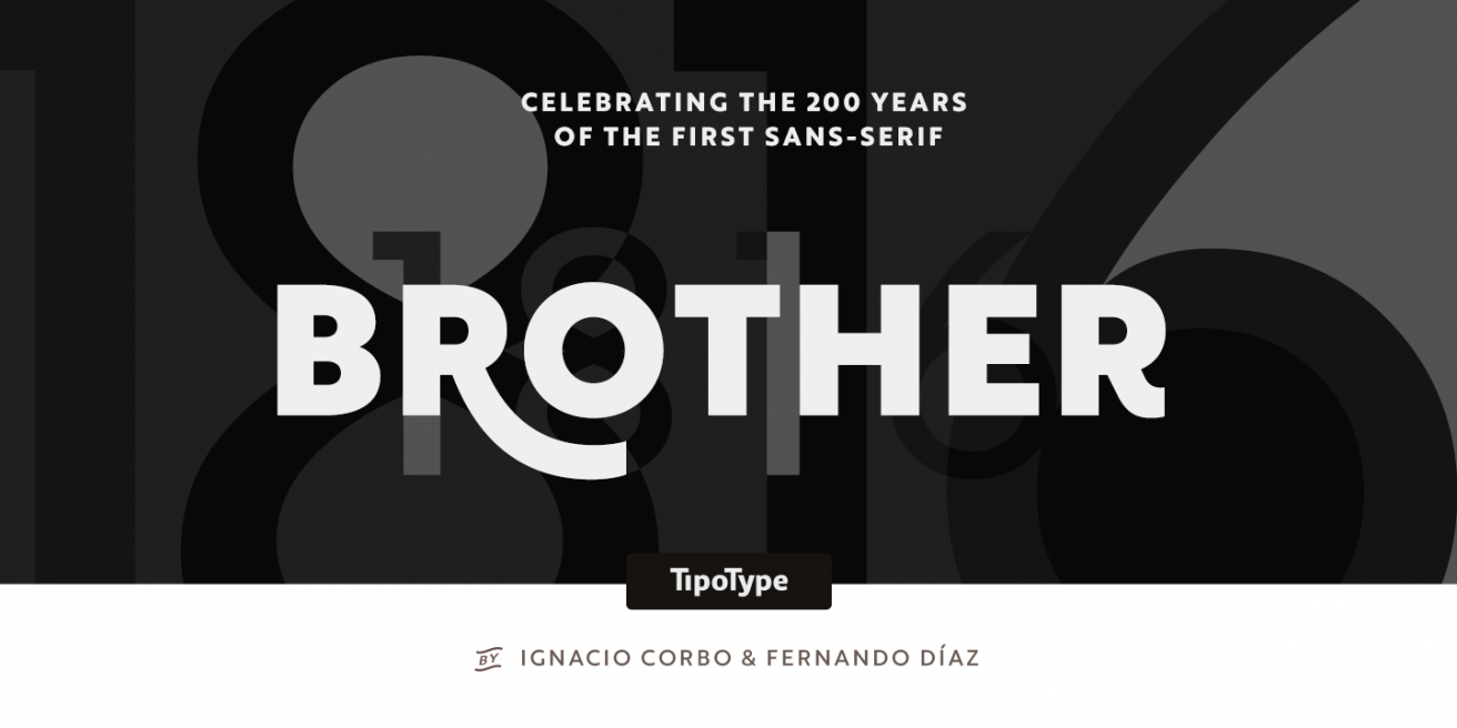
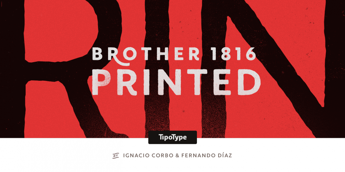
Brother 1816 - 2 Great Styles For One Low Price
|
|
|
|
|
We sell a lot of “Design Kits” - families that
include
multiple genres of fonts within the family. They’re great because contained within one
family
you get different styles of fonts that serve a multitude of purposes. It also means, though,
that each style is underrepresented when it comes to the number of weights or variations you
get. As a result, you can put a design together very quickly with these diverse families,
but
your customization of that style can be lacking.
|
|
|
Pick
up this 32 font family for
$38
|
|
|

|
|
|
Brother 1816 by Tipotype takes a different
approach. It pairs two styles together, a geometric sans with a roughly-outlined display
sans, then expands each of those ideas into a fully fleshed out 8 weight, 16 font family.
The result is a family you can pair together well with the added flexibility that you don’t
normally get from the broader design kit trend.
|
|
|
|
|
First you have the sans serif version, which would
be worth featuring all by itself in this newsletter. It’s a geometric sans with some
humanist elements, and a clean set of outlines perfect for web or app embedding, magazines,
billboards, you name it. It can work as a text font, but that’s not its main strength. The
variation and style each character has lends it much more to being blown up and shown in
large sizes. The weights focus on the thicker and thinner ends of the spectrum, giving you
more options specifically for display use.
|
|
|
|
|
Not only do you get that sans, which would be
enough on
its own, you also get a printed version. A font-for-font match to the sans family, it has
similar proportions and curves, but now instead of sharp angles, you have blunted ends
thanks to
its rough outline. It’s perfectly suited for modern designs, where you already see vintage
roughness mixed with clean, contemporary styles.
|
|
|
|
|
Put them all together and you have two fonts that
you
know will pair well, each of them perfectly usable in their own right. You also have a suite
of
extras, like stylistic alternates, angular and straight edges, swashes, ordinals and more!
Not
to sound like a TV salesman, but that’s a huge value all for $37.99. Even if you just need
the
sans, it’s well worth that value, so you can think of the Printed version like a free
add-on.
|
|

|
|
|
Grab
this 32 font family for
$38
|
|